Thumb keyboard concept for the iPad
Update: Try live working demo!
iPad will be a great device for casual reading and web surfing. Not so for writing. The lack of tactile-feedback is one reason. The form-factor is another.
The great thing about the iPad is being able to hold it in your hands. To use the default keyboard, you’d have to hold it in one hand while typing with the other — not so comfortable. Or lay it on a flat surface, which takes away from the form-factor benefits.
Why not use your thumbs? You can hold it with both hands and use both thumbs for typing. Thumb-based keyboards are a plenty:



The default iPad keyboard (as gleamed from the photos), has 37 keys.

- 26 – A-Z
- 2 – right/left shift
- 2 – right/left numeric
- 2 – punctuation
- 2 – meta
- 1 – delete
- 1 – search/enter
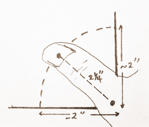
With inside screen dimensions (sans bevel border) of roughly 5.82″ x 7.76″, I estimate key dimension to be about .4″ for the typical alphanumeric keys, plus the space around it.
The length of my thumb is about 2 ½” long. So, including intra-key spacing, roughly four keys should be easily within reach of a single thumb.
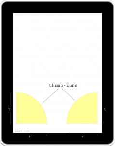
The thumb-zone on the iPad is a roughly 2″ radius area around the two corners.
Thumb keys – Concept 1
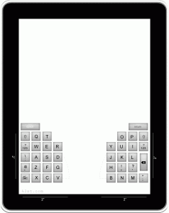
Here’s a keyboard design concept with the keys arranged around the two corners within easy reach of the thumbs.
This key configuration has 39 keys, with roughly the same dimensions as the default iPad keyboard. The main alphanumeric keys are arranged in a 4×4 grid on each side of the tablet, with the rest of the keys on top.
One problem with this layout is that the keys do not fall within the familiar QWERTY layout, and this could impact usability.
Thumb keys – Concept 2
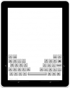
This design follows the QWERTY layout (with slight modification) while keeping the majority of the keys within the thumb-zone. The Q, O, and P keys are moved up one row, but are still within the proximity of their original positions.
This layout has 38 keys, including an elongated space key.
In real life
How does the thumb keyboard play in real life. Well, there is no iPad available yet, but my trusty composition book has dimensions remarkably close to the iPad! Here’s what it might look like.
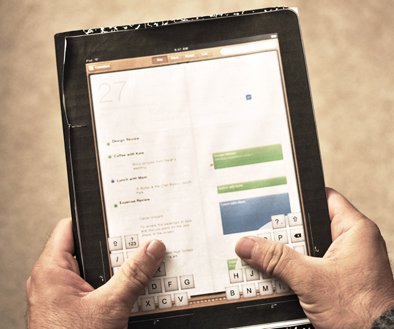
(This mock-up is from an earlier layout with the space key on the right.) Usability is quite good. All keys are withing range of my thumbs and in their familiar place (except the Q, O, P keys).
Any chance Apple will add this as an optional layout on the iPad?!
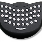
Update: Looks like others have been thinking along the same lines. I like Scot Robbin’s split space bar in Concept: iPad Split Keyboard. I’m less enthused about the duplicate keyboard design over at lonelysandwich. Dan Moran makes a good case for a thumb-centered virtual keyboard in the text’s the thing. Then there is the curved keypad, which although nice looking, may have usability issues. Gizmodo contends scaling the iPhone’s keyboard to the iPad doesn’t make much sense, although that’s not what Apple thinks!
Update 2: (June 6, 2011) Split keyboard for iOS5 is coming!
