Archive for the ‘webkit’ tag
Introducing touch-enabled spinControl
Hot on the heels of sliderControl comes its close cousin, the spinControl. Whereas in the sliderControl, the thumb widget is moved across a fixed set of values to select the desired input, in the spinControl the whole set is movable. This allows for larger set of data that can fit on the visible screen.
All the features of sliderControl are supported (kinetics, bounce, snap, toggle, events handlers, etc.). Additionally, a new alignToEdge option allows the scroll area to align to the left and right edge of the viewport instead of its center.
For gory details, demo and download, see spinControl page.
Bonus
Also included is a spinToggle class that mimic’s iPhone’s toggle switch, complete with slide action.
Emulating iPhone’s slide-to-unlock
The touch-enabled sliderControl covered earlier is an easy UI widget to select a value from a set or a range of numbers. It can be easily modified to function as a slide-to-unlock contorl that you see on the iPhone. Enter the slideToAction control:
mySlider6 = new slideToAction('#slider6', ['slide to unlock'], {
	onchange: function(){
		alert('unlocked'); // some useful action!
	}
});
Markup:
<div id="slider6" class="slider"></div>
When the thumnail is moved all the way to the end, the onchange handler gets called. Simple. slideToAction inherits all of sliderControl’s kenetics and emulates the spotlight effect of iPhone’s control.
slideToAction is included as part of sliderControl. See item #6 ‘single value slider’ on the demo page.

(The thumbnail looks better on the iPhone browser!)
The spotlight effect of the label text is achieved using -webkit-mask-* CSS attribute and animating the -webkit-mask-position property. Here’s the CSS:
.sliderAction .sliderLabel {
	font-size:18px;
	font-weight:normal;
	text-shadow:none;
	color: #fff;
	-webkit-mask-image: -webkit-gradient(linear, 35% top, 65% top,
           from(rgba(0,0,0,.20)), color-stop(.5,rgba(0,0,0,1)), to(rgba(0,0,0,.20)));
	-webkit-mask-size: 50%;
	-webkit-mask-repeat: none;

	-webkit-animation-name: spotlight;
	-webkit-animation-timing-function: linear;
	-webkit-animation-duration: 1500ms;
	-webkit-animation-iteration-count: infinite;
}
using the animation keyframes:
@-webkit-keyframes spotlight {
    from {-webkit-mask-position: 0;}
    to {-webkit-mask-position: 100%;}
}
The -webkit-mask-position property is animated on desktop Safari 4.x and Chrome 4.x. It isn’t supported on iPhone OS 3.1.2 browser… but hopefully it will under 3.2.
Update: (11 March 2010)
New version 0.1a has an updated slideToAction() that looks more like the real thing. Here’s a screenshot.

Seems like SDK developers have been trying to get this feature implemented as well. See here and here.
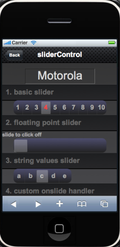
Introducing a touch-enabled slider control

I needed a touch-enabled slider input control for a project I was working on. Unfortunately there was no good existing solution, so I rolled my own.
Features:
- kinetic snap to value
- optimized CSS animation
- full range of slider values supported
- customizable with extensive options
- fully programmable
- event callbacks
- adjusts on orientation change
- works on desktop webkit browsers (for testing)
- theme to taste!
See sliderControl page for details.